American Express | Click to Pay
Designing a consistent, secure, and streamlined checkout experience in the form of a digital wallet.

Overview
The Challenge
Customers were faced with a sea of payment options and varied, rendundant checkout experiences across merchants. This lack of consistency and disjointment resulted in potential frustration for the customer and loss of business for the merchant.
The Solution
American Express, Mastercard, and Visa launched a checkout solution based on a set of standards called SRC (Secure Remote Commerce). The solution, ‘Click to Pay’, functioned like a digital wallet and was a more secure, streamlined option for shopping online.
I was brought on as a product designer and worked closely with product managers, developers, and a designer on a partnering team to bring our flavor of Click to Pay to launch in October 2019.
Discovery and research
Getting up to speed
As a newcomer to Amex and the realm of finance, I needed to prime myself on the processes and decisions that powered this new checkout experience. In order to do this I read over previous design briefs, watched webinars on relevant, and scheduled coffee chats with various stakeholders and teammembers.
Competitive analysis
In order to assess what worked well and what didn't work well for a digital wallet model, I compared PayPal, GooglePay, and ApplePay. I contrasted how they onboarded users, how they stored sensitive information, and the steps it took to complete a purchase.
The Users
Cardmembers
Cardmembers were considered the primary users for this experience.
The goal was to provide an intutive option to store card and payment information in a secure way so that customers had a dependable and familiar method to check out across various merchants.
Merchants
In place of their own checkout process, merchants could opt for Click to Pay, ensuring a streamlined and secure experience for their customers.
Our goal was to provide guidance and support when integrating this new feature as it was rolled out.
Banks and Issuers
The banks and issuers acted as a sort of liason between the cardmembers and Click to Pay initiative.
We counted on them to provide educational information on the feature and ability to enroll, and so our goal was to maintain consistent communication and provide detailed guildelines.
Building and testing
QA Testing
As a part of the development process, the developer on the team led QA testing. As changes were being made, the Project Manager and I were able to use the testing environment to monitor the development, suggest improvements, and run through the experience to understand edge cases and problematic user flows.
Guerilla Usability Testing
Without the time or budget for testing, I decided to take matters into my own hands in order to validate the user experience. I sat down with 5 people around the office (not involved in the project) and led them through 5 tasks to gauge usability. These tasks helped me to not only identify potential issues in the tasks being accomplished, but also revealed areas for opportunity in adjacent tasks.
Design, iteration, and launch
When I joined the team there was already a foundational design. I was asked to finetune the visual design and suggest iterations and new features.
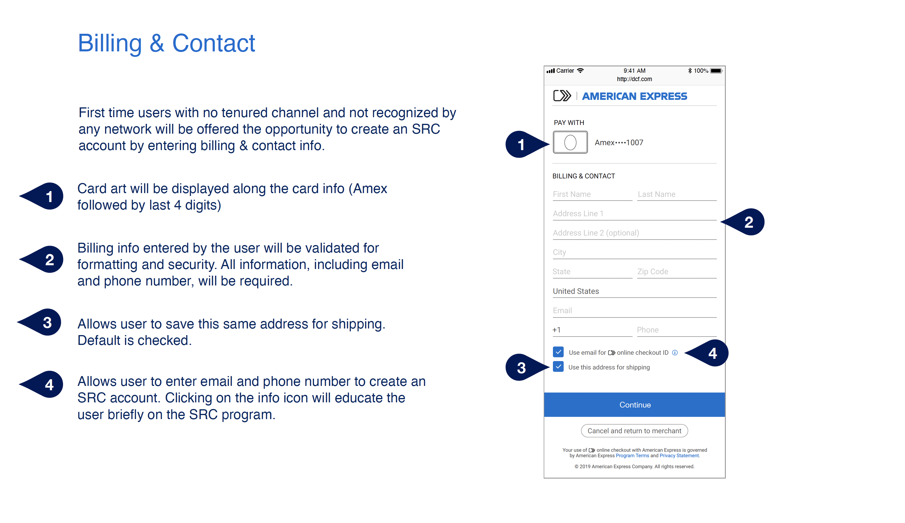
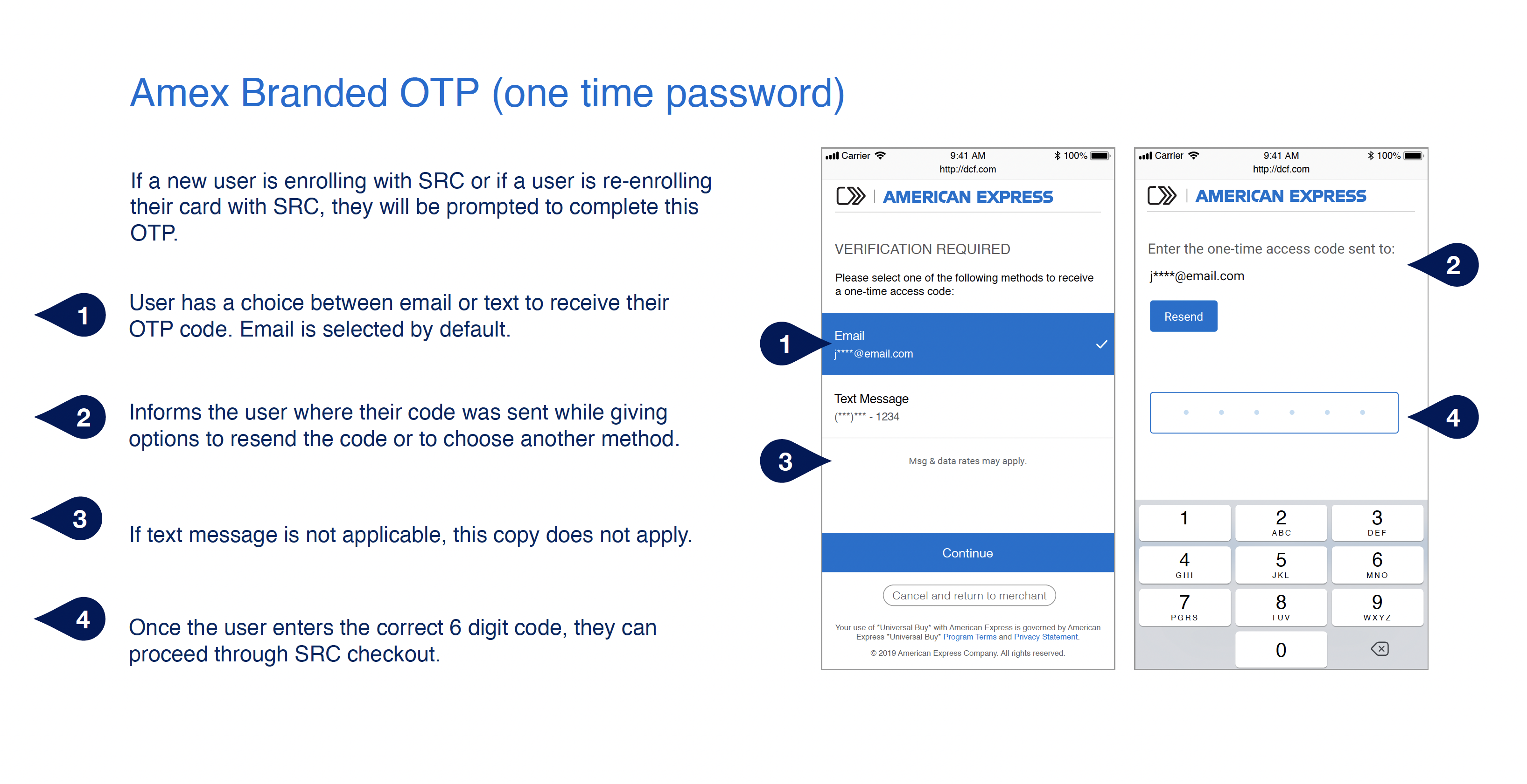
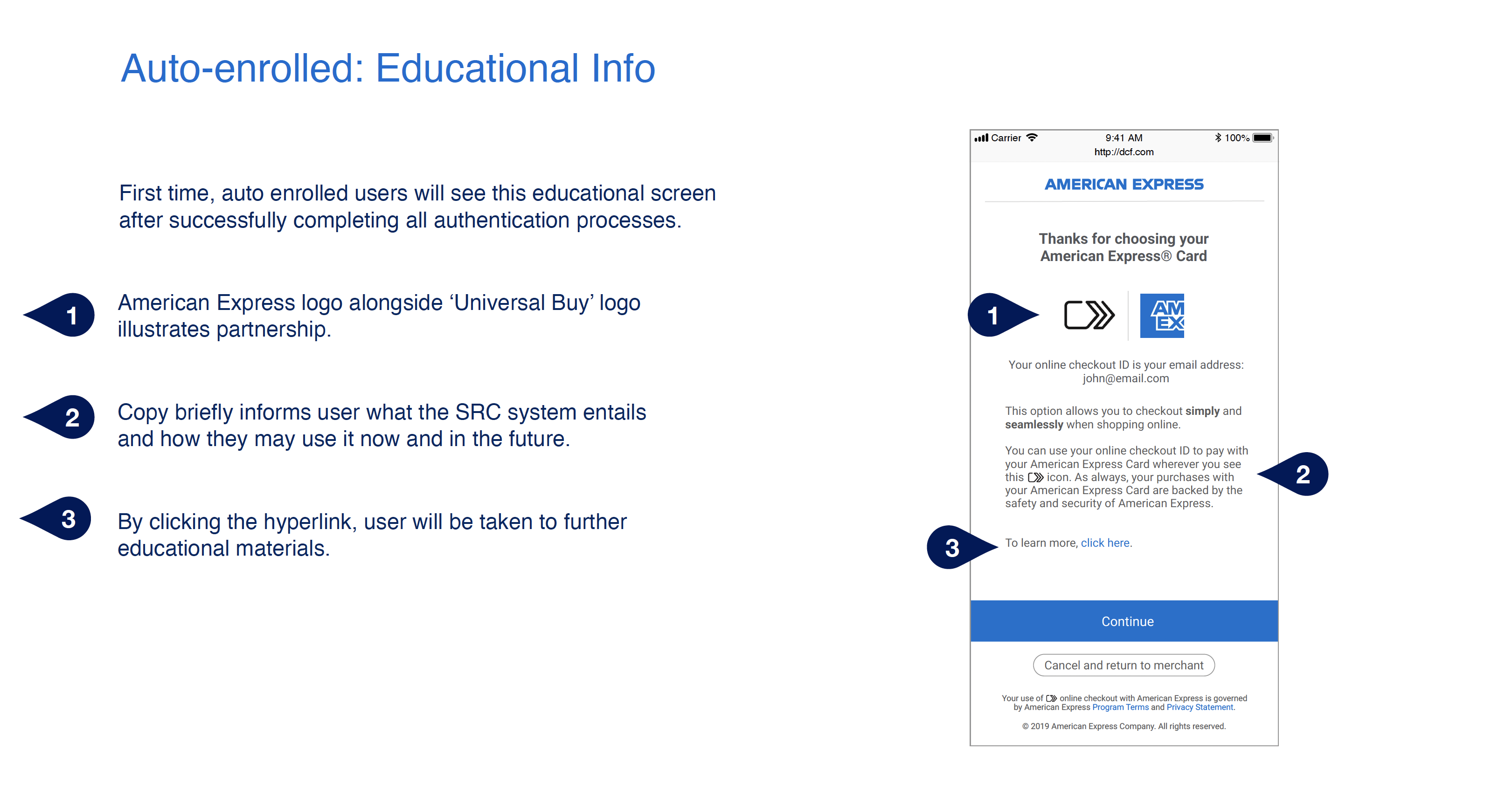
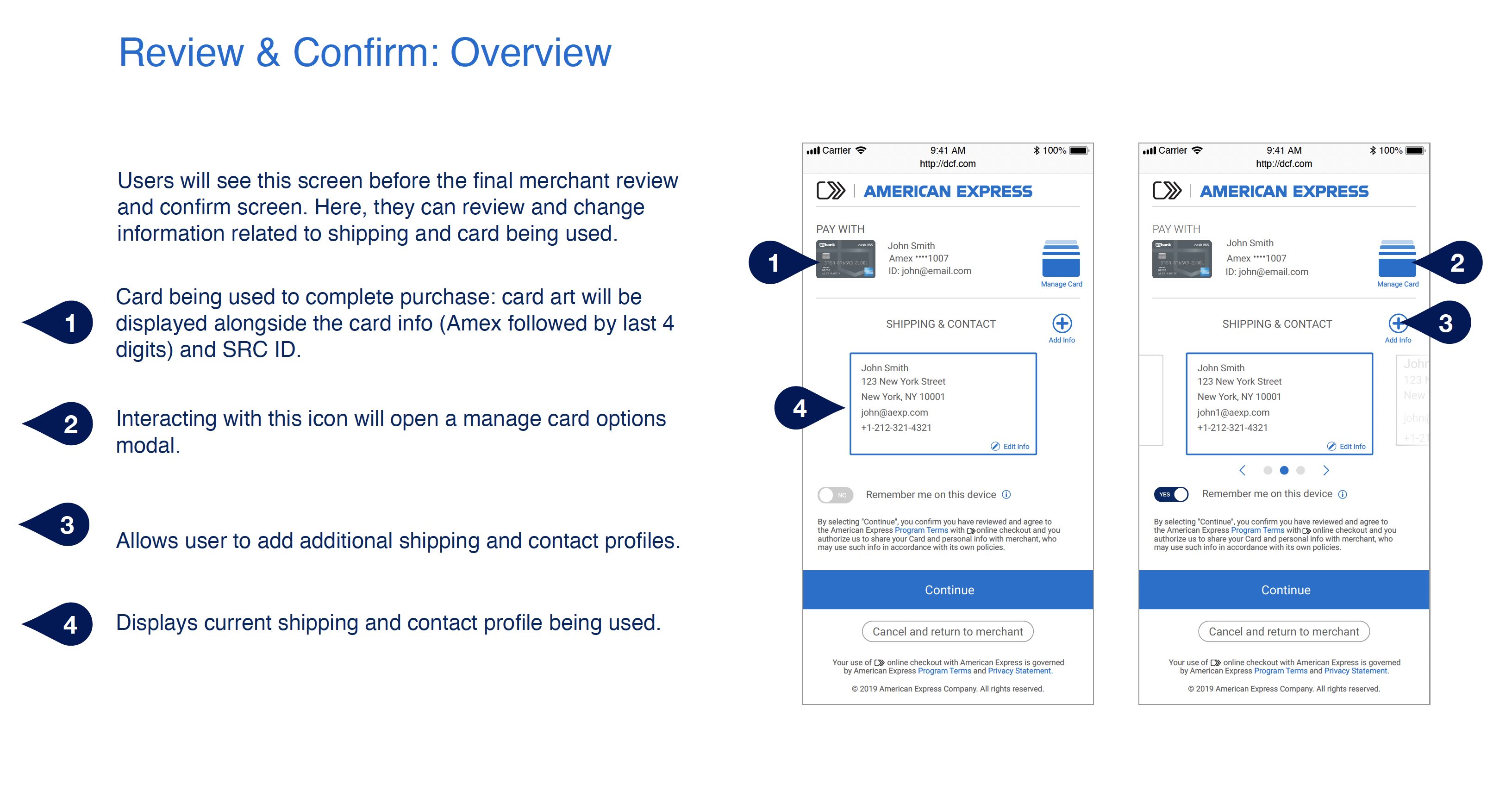
As I gathered information and built partnerships with project managers, developers, and business stakeholders, I built out features to ensure the experience was seamless end to end.
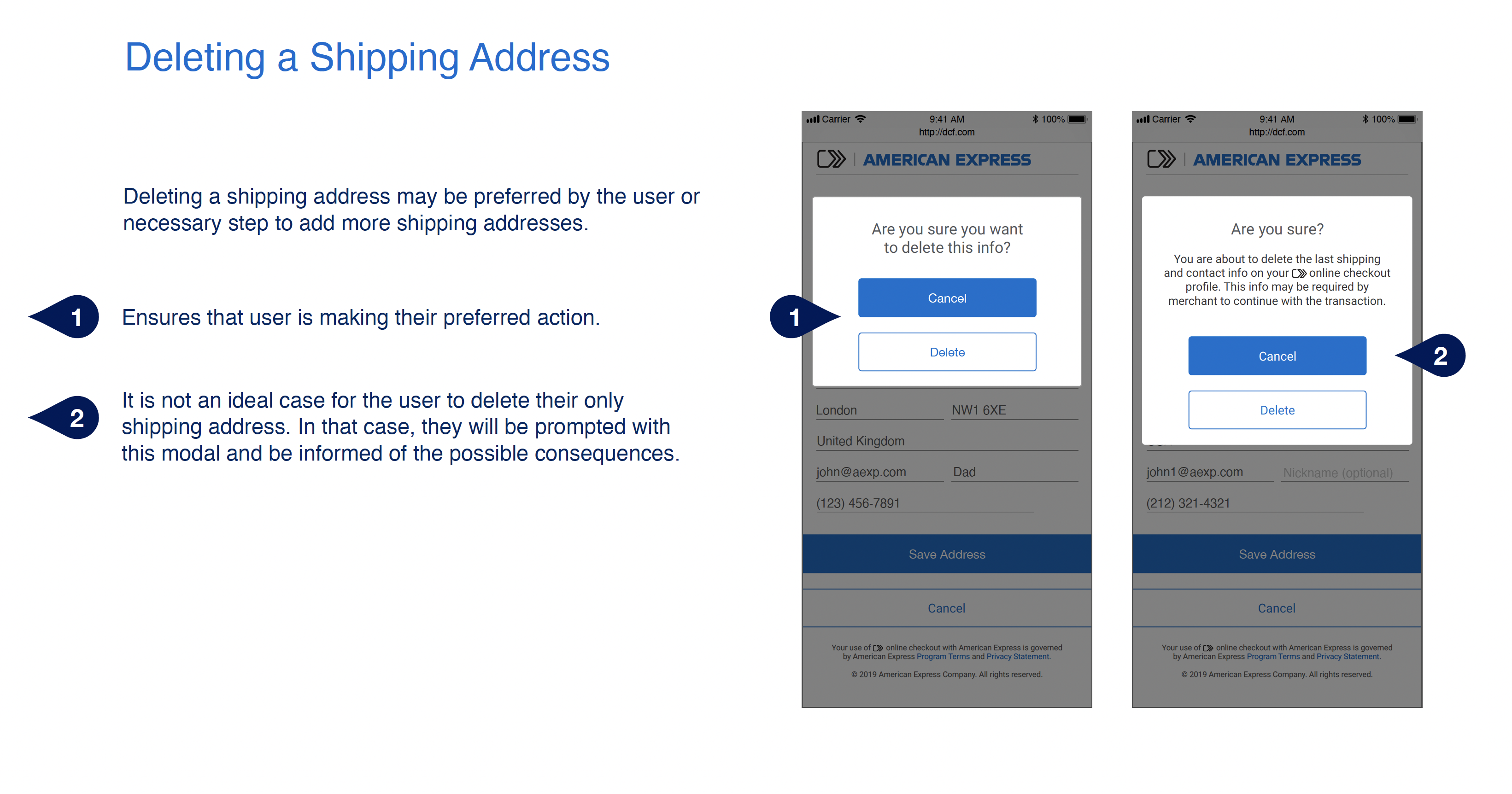
MVP release highlights
Results
Click to Pay successfully launched and is used by over 70 million users. Its use has resulted in higher conversion rates and is now a standard across many checkout experiences.
