Ollie Design Challenge
A checkout conversion challenge for a human-grade dog food subscription service
PLATFORM
iOS app
TIMEFRAME
4 days
TOOLS USED
Sketch, Invision
Overview
This design challenge focuses on the Ollie subscription plan selection. Currently, users are presented with recipe and payment options after completing a short onboarding exercise in which they answer questions about their dog.
Goals
Create a plan selection flow that:
-presents Ollie recipe and subscription options in a simple and clear way
-encourages customers to follow through to checkout
Problem
The Ollie plan selection process is slightly complex due to the level of customization Ollie offers. This may be overwhelming to users and cause them to drop out of the checkout process.
Process
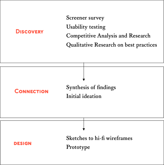
Discovery
Usability Testing
I led 4 users through the current Ollie purchase flow, from onboarding to checkout .
During the plan selection phase I found that:
Users took a lot of time mulling over choices before deciding
Users missed key information such as discounts and FAQs
Users wanted to know more about how their plan was recommended
Users felt slightly rushed and didn’t feel they could choose an option confidently
Competitive Analysis
For the purposes of this design challenge, I focused on e-commerce competitors who are in the food and meal space. I looked mainly at the subscription-based services when comparing products. Here, I quickly analyzed and compared features that are a part of the subscription choice flow in the Farmer's Dog and Blue Apron's products.
Qualitative Research
I consulted a number of design authorities such as the Invision Blog, UI Patterns, and the Interaction Design Foundation to understand the best practices and the psychology behind subscription plan choices.
Hick’s law: the more choices a user is faced with, the longer it takes them to decide
Order matters: The order options are in affect a user’s choice more than color or other visual elements. The best order is left to right
Guide users to a choice: make options scannable and highlight recommended options
Design
Sketches
To begin the design phase, I conducted a quick solo design studio where I laid out high level design concepts.
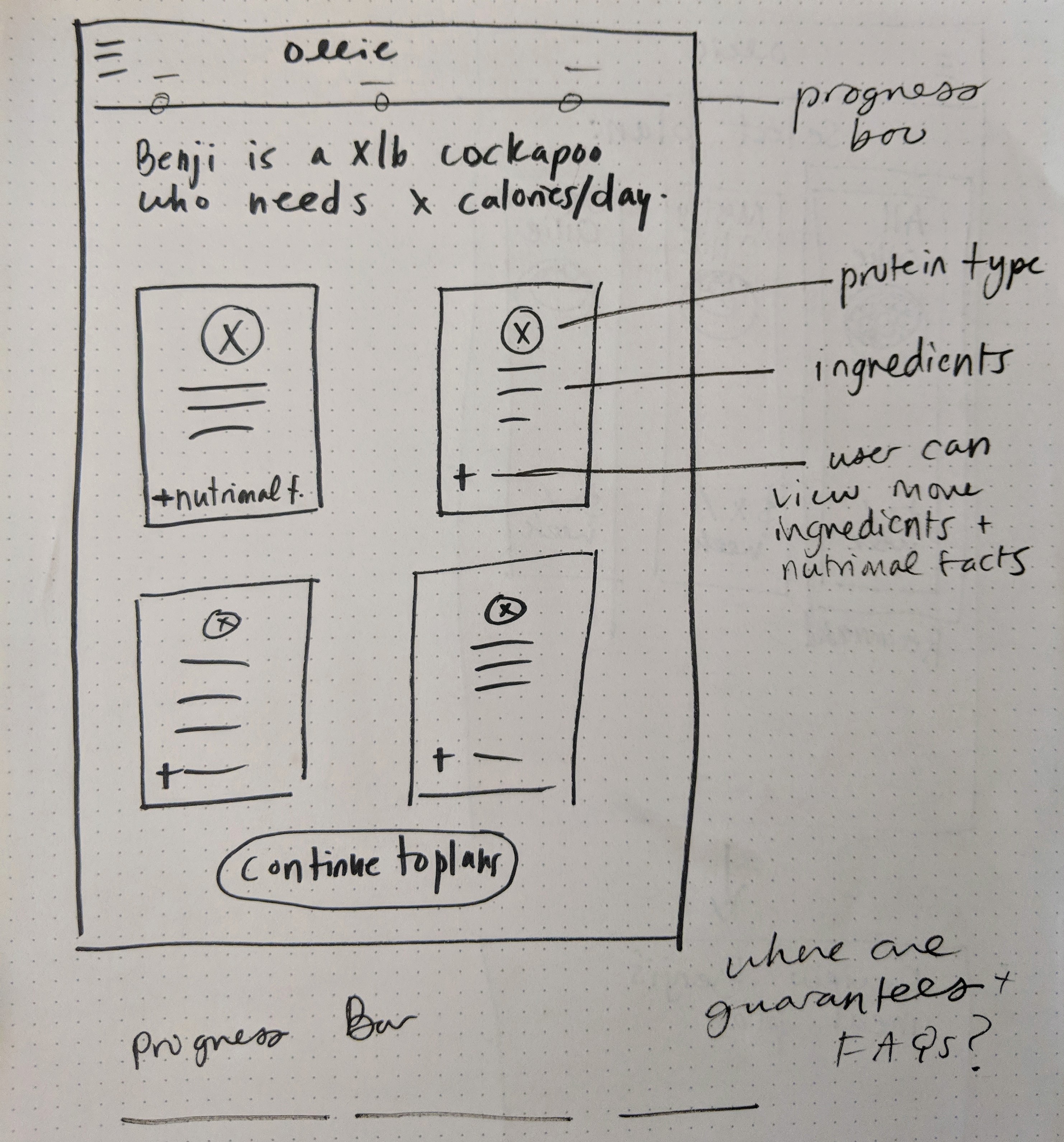
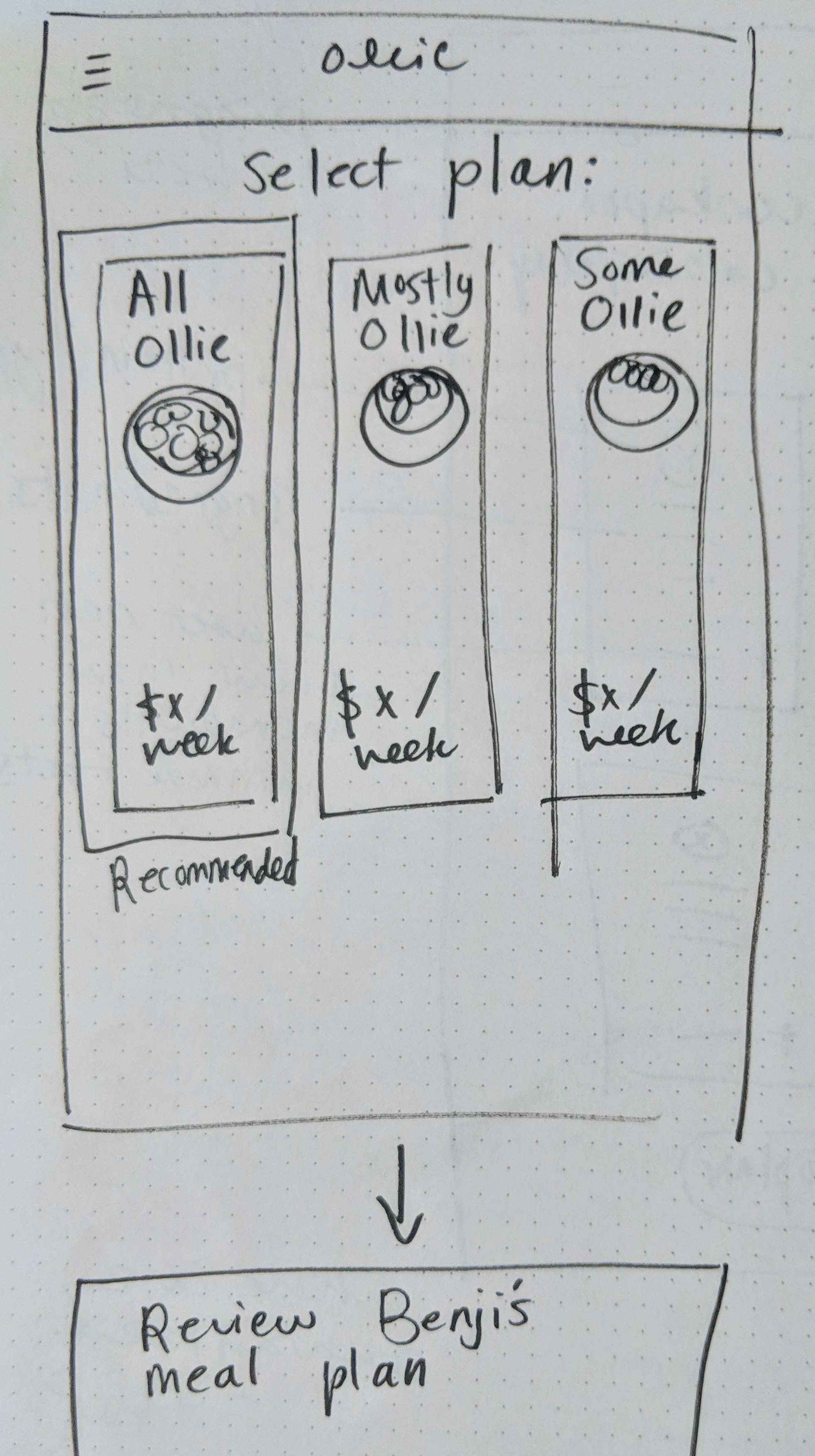
Mid Fidelity Wireframes
I then moved into designing out some mid-fidelity wireframes in order to better conceptualize composition and space.
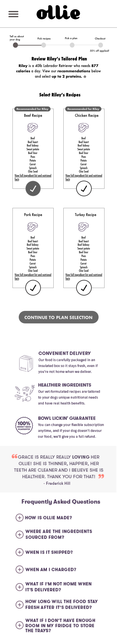
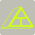
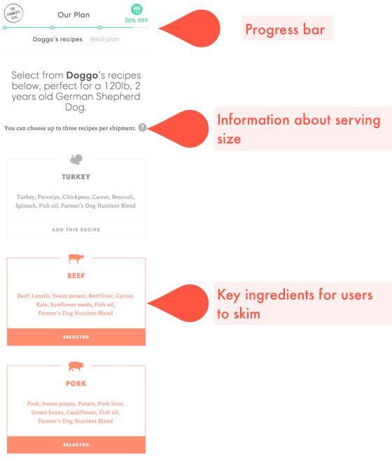
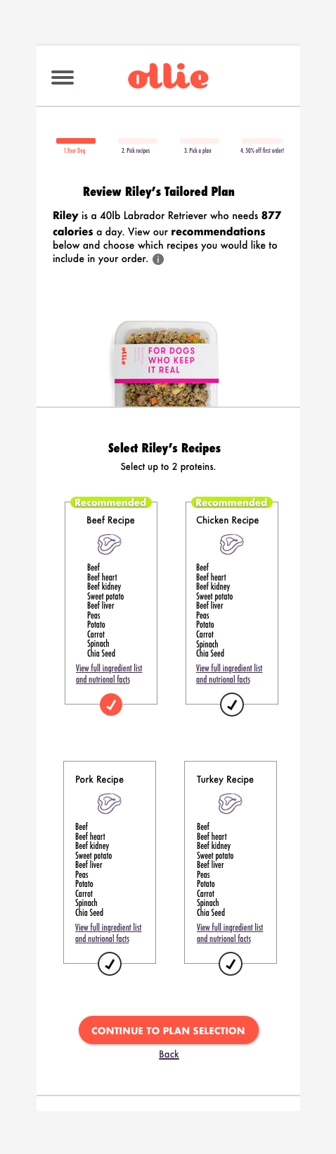
Recipe Selection: Hi-Fidelity Wireframe
For this phase, I focused on arranging information in an easily scannable way and options to see more information if desired. Recommendations and progress through the short process are easily indicated.
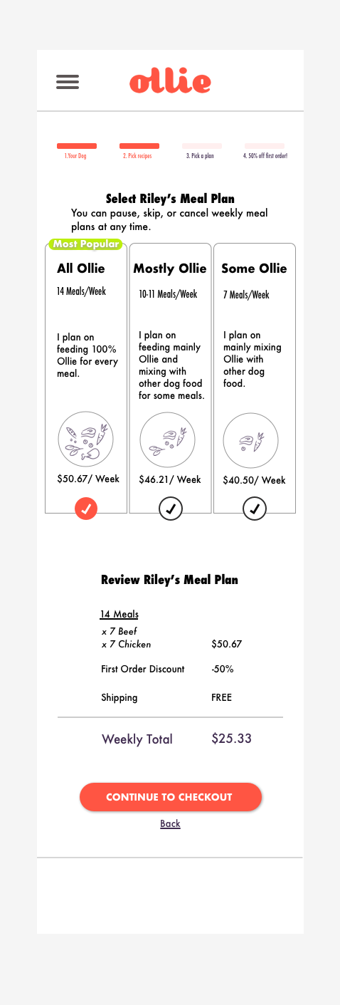
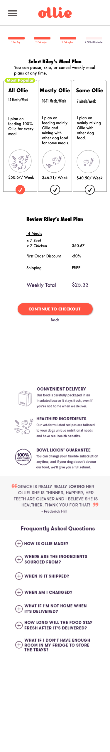
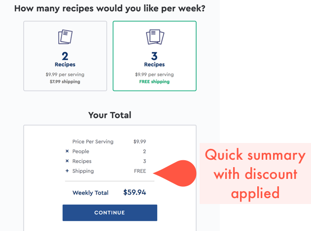
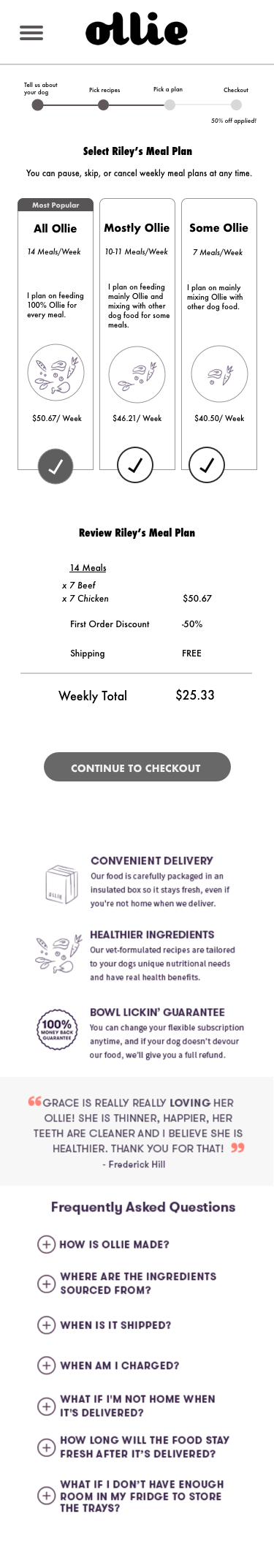
Plan Selection: HI-Fidelity Wireframe
Here, I arranged the plans from left to right for easy comparison and included a visual concept of each plan’s offerings. The plan summary highlights the first time user discount.